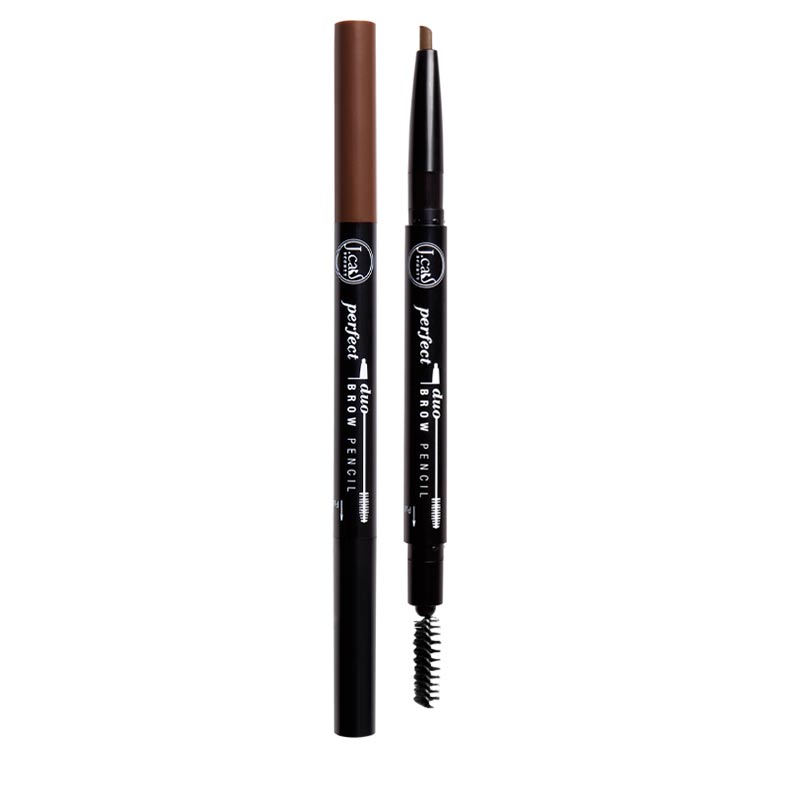
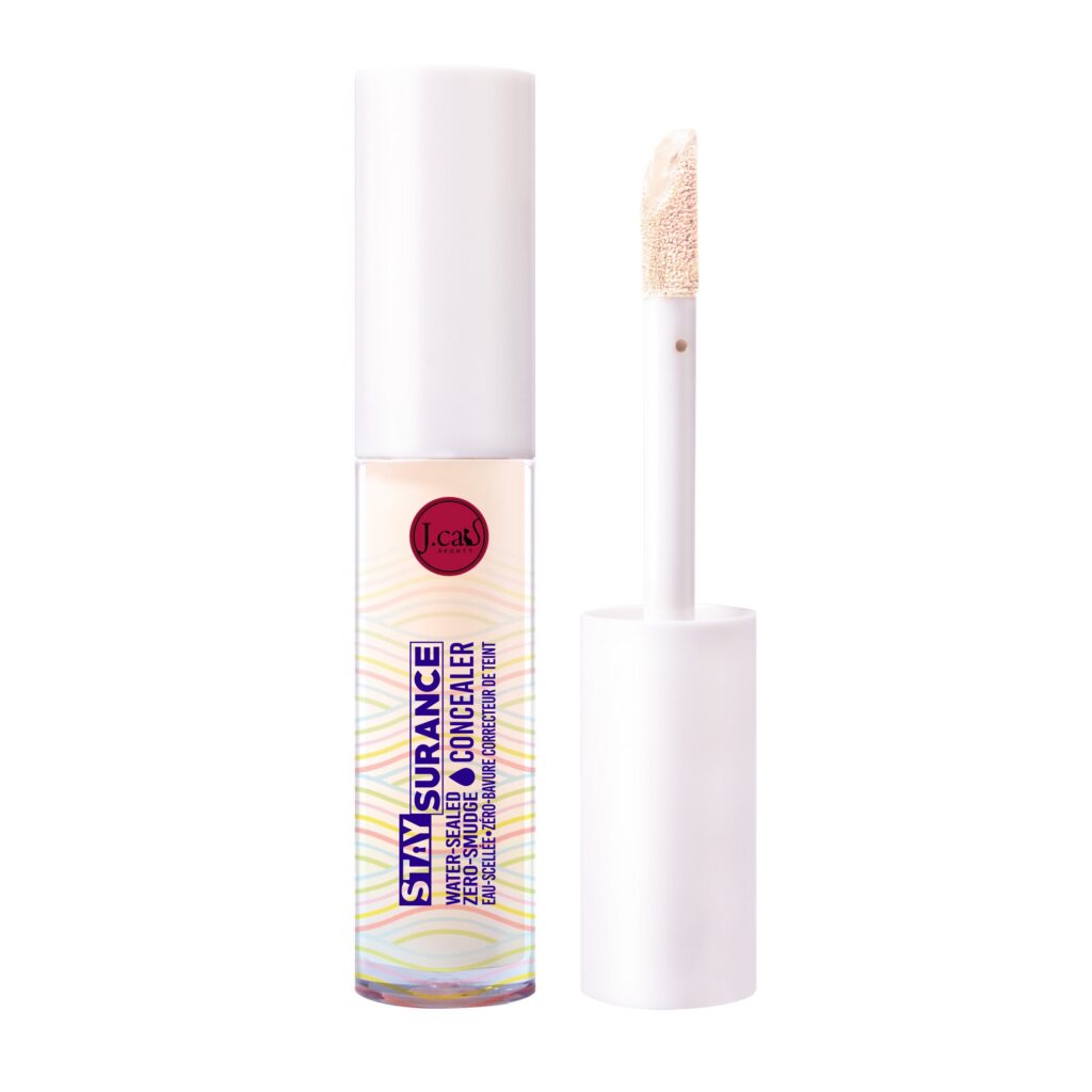
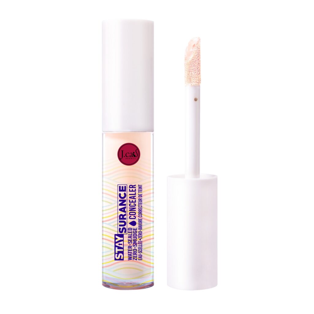
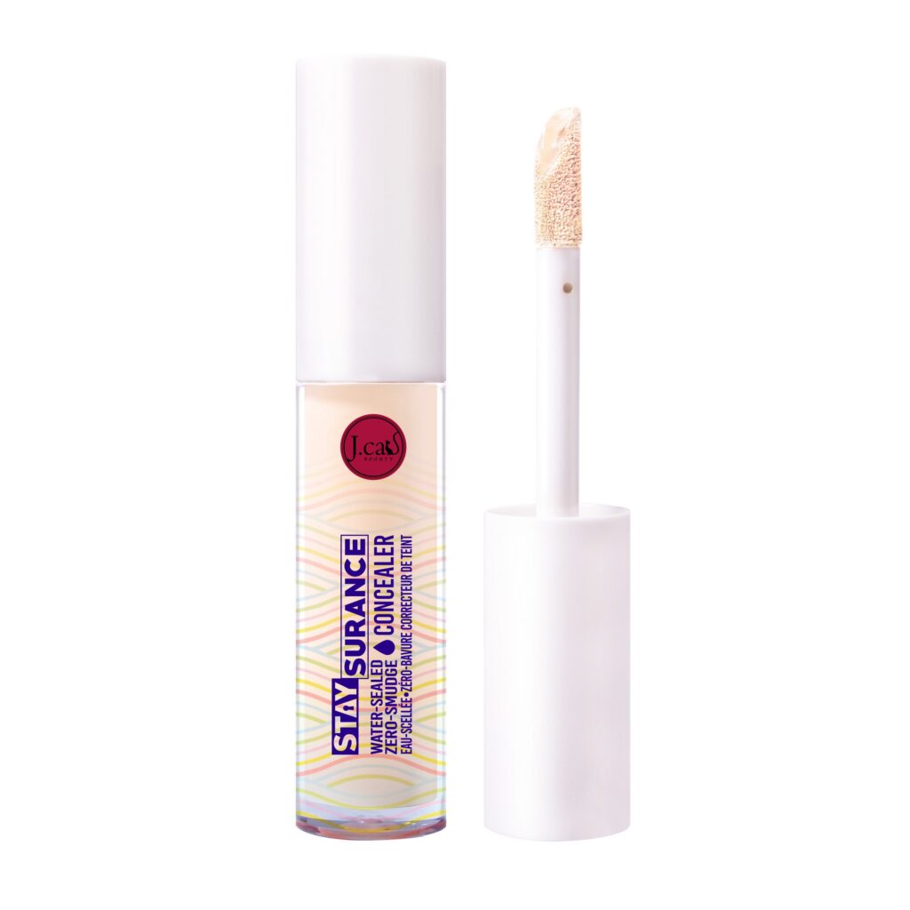
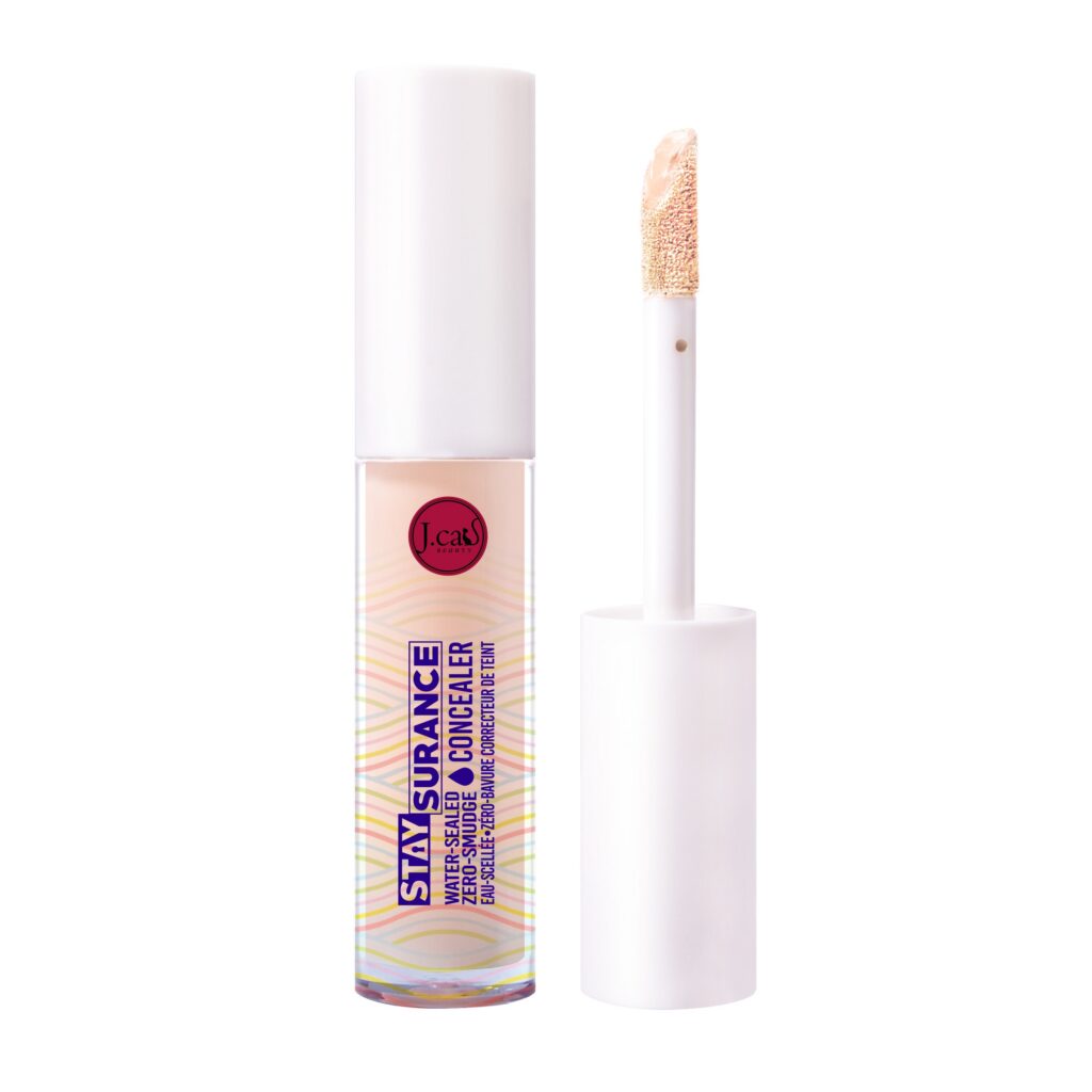
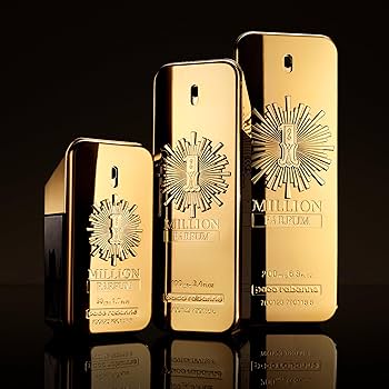
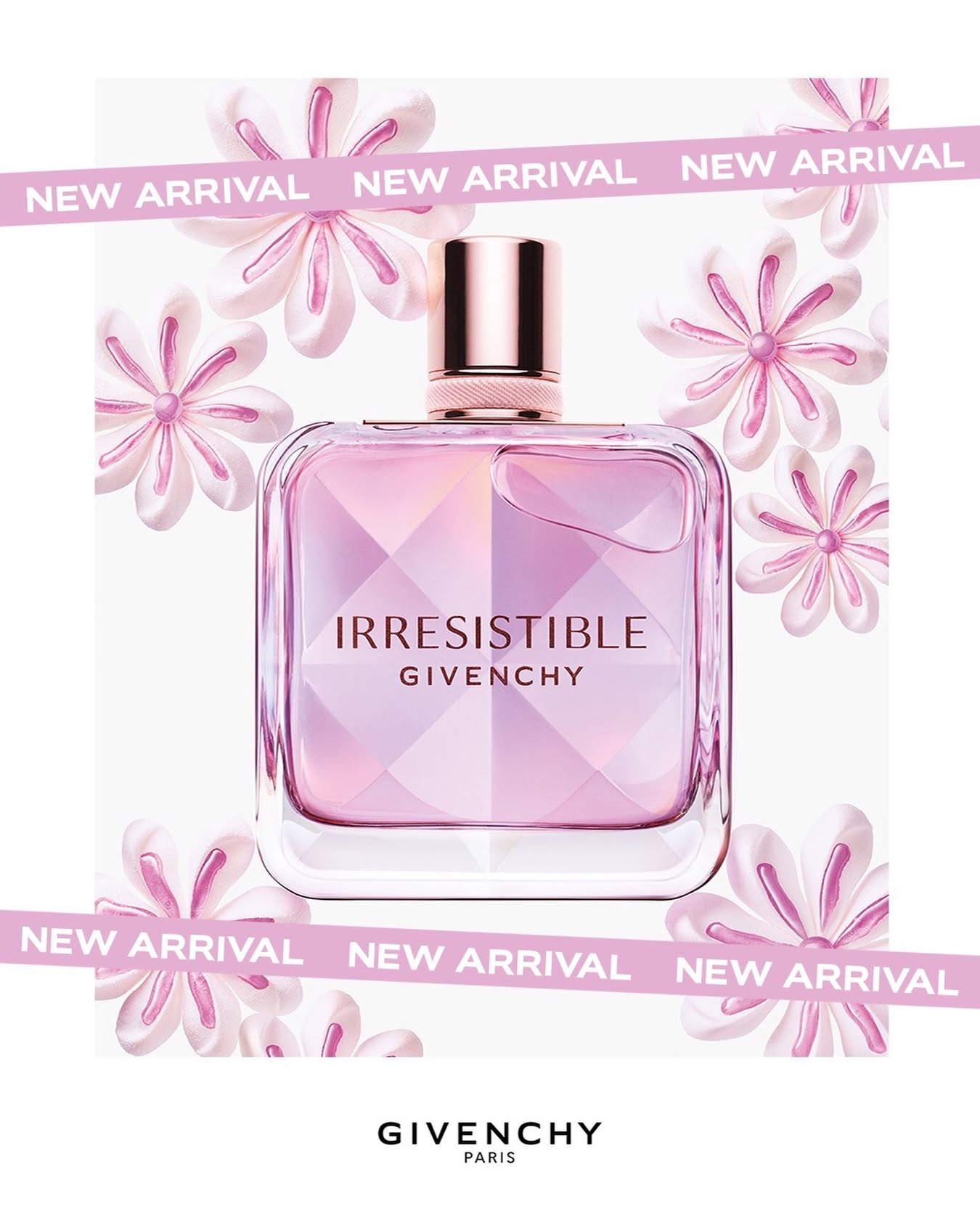
Color
- 101 Light/Medium 1
- 102 Medium Deep 1
- 102 Sprinkle Magic 1
- 103 Cherry Limeade 1
- 103 WCW 1
- 104 Angel Kisses 1
- 106 Motd 1
- 106 Snookums 1
- 108 Honey Me 1
- 108 Smh 1
- 108 Sweetheart 1
- 109 FBF 1
- 110 Babe 1
- 110 Just Blushin 1
- 111 Baby Mochi 1
- 112 Pudding Pop 1
- 114 I Can 1
- 115 Thank You Berry Much 1
- 35 Eye Came Alive 1
- BDP103 Chestnut 1
- BDP104 Auburn 1
- BDP106 Brown 1
- BDP107 Dark Brown 1
- FC101 Freedome First 1
- GBB103 Cancun Golden Tan 1
- LMP102 Introvert 1
- LMP105 Essential 1
- LMP108 Blessed 1
- Nouche 1
- SBP103 Chocolate 1
- SBP104 Brown 1
- SBP105 Espresso 1
- SHC101 Porcelain 1
- SHC102 Shell 1
- SHC103 Pearl 1
- SHC105 Vanilla Bean 1
- SHC106 Banana 1
- SHC107 Custard 1
- SHC108 Buff 1
- SHC109 Soft Tan 1
- SHC110 Cappucino 1
- SHC111 Sunkissed 1
- SHC112 Deep Autumn 1
Online store of household appliances and electronics
Then the question arises: where’s the content? Not there yet? That’s not so bad, there’s dummy copy to the rescue. But worse, what if the fish doesn’t fit in the can, the foot’s to big for the boot? Or to small? To short sentences, to many headings, images too large for the proposed design, or too small, or they fit in but it looks iffy for reasons.
A client that’s unhappy for a reason is a problem, a client that’s unhappy though he or her can’t quite put a finger on it is worse. Chances are there wasn’t collaboration, communication, and checkpoints, there wasn’t a process agreed upon or specified with the granularity required. It’s content strategy gone awry right from the start. If that’s what you think how bout the other way around? How can you evaluate content without design? No typography, no colors, no layout, no styles, all those things that convey the important signals that go beyond the mere textual, hierarchies of information, weight, emphasis, oblique stresses, priorities, all those subtle cues that also have visual and emotional appeal to the reader.