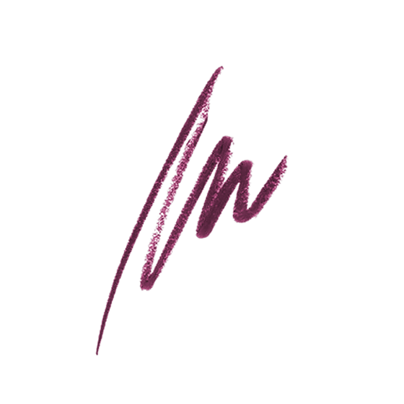
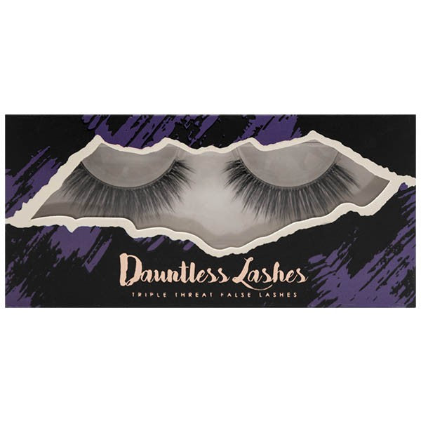
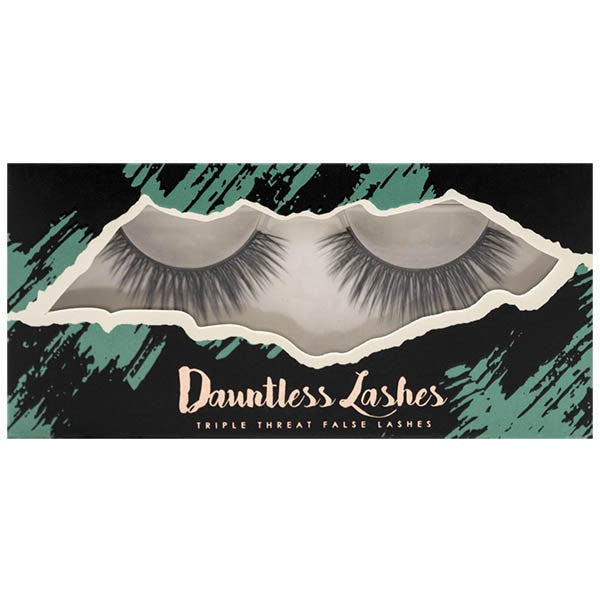
Color
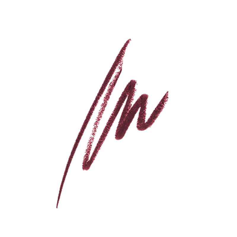
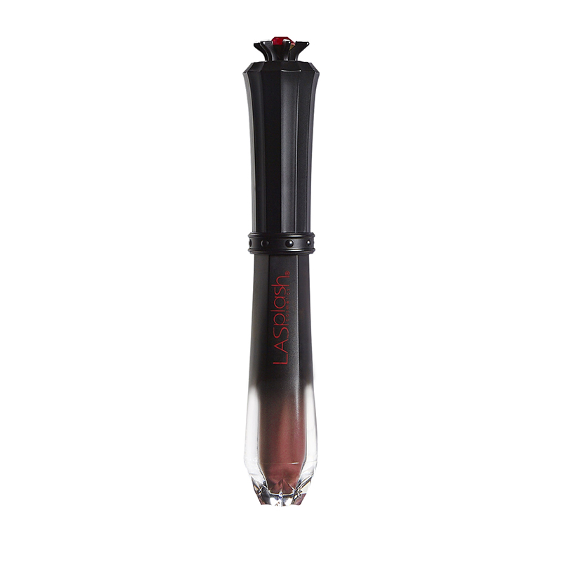
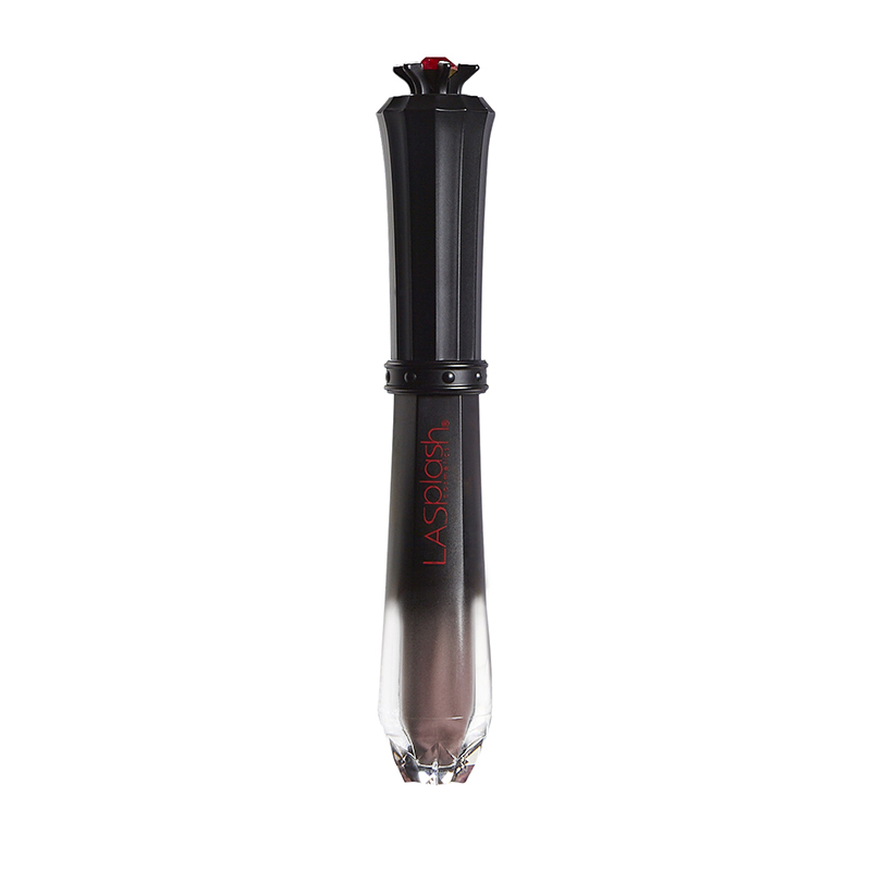
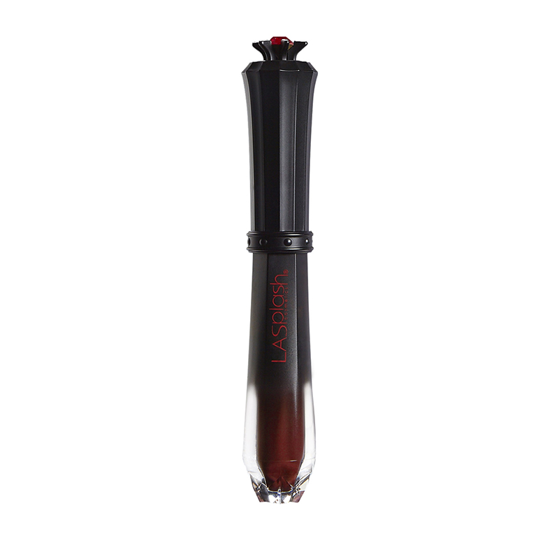
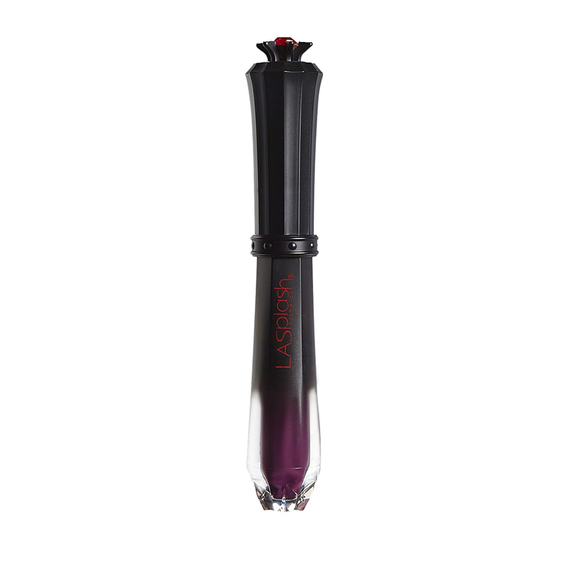
- 14201 Innocent Vixen 1
- 14203 Poison Apple 1
- 14208 Lollipop 1
- 14209 Latte Confession 1
- 14309 Bella Donna 1
- 14404 Venus 1
- 14601 Exposed 1
- 14602 Romance 1
- 14612 Tiramisu 1
- 14613 Can't Even 1
- 14616 Strawberry Colada 1
- 14621 Souttle 1
- 14622 Blackberry Buttercream 1
- 14625 Hibiscus Panna Cotta 1
- 14626 Razzberry Crumble 1
- 14807 Gleam 1
- 17205 Dhalia 1
- 17206 Carnaby Orchid 1
- 17210 Hydrangea Taupe 1
- 17302 Rosette 1
- 17303 Rustification 1
- 17304 Terra Cotta 1
- 17305 Tuscan 1
- 17306 Corinthian 1
- 17307 Calligraphy 1
- 17308 Belvedere 1
- 17309 Serpentine 1
- 17310 Mosiac 1
- 20201 Macadamian 1
- 20204 Almond 1
- 20205 Pecan 1
- 20206 Hazelnut 1
- 20209 1
- 20210 Caramel 1
- 20211 Tofee 1
- 20301 Nude 1
- 20302 Natural 1
- 20303 Vanilla 1
- 20304 Warm Beige 1
- 20305 Natural Beige 1
- 20306 Tan 1
- Lumos 1
Size
- 3ml 1
Online store of household appliances and electronics
Then the question arises: where’s the content? Not there yet? That’s not so bad, there’s dummy copy to the rescue. But worse, what if the fish doesn’t fit in the can, the foot’s to big for the boot? Or to small? To short sentences, to many headings, images too large for the proposed design, or too small, or they fit in but it looks iffy for reasons.
A client that’s unhappy for a reason is a problem, a client that’s unhappy though he or her can’t quite put a finger on it is worse. Chances are there wasn’t collaboration, communication, and checkpoints, there wasn’t a process agreed upon or specified with the granularity required. It’s content strategy gone awry right from the start. If that’s what you think how bout the other way around? How can you evaluate content without design? No typography, no colors, no layout, no styles, all those things that convey the important signals that go beyond the mere textual, hierarchies of information, weight, emphasis, oblique stresses, priorities, all those subtle cues that also have visual and emotional appeal to the reader.